 |
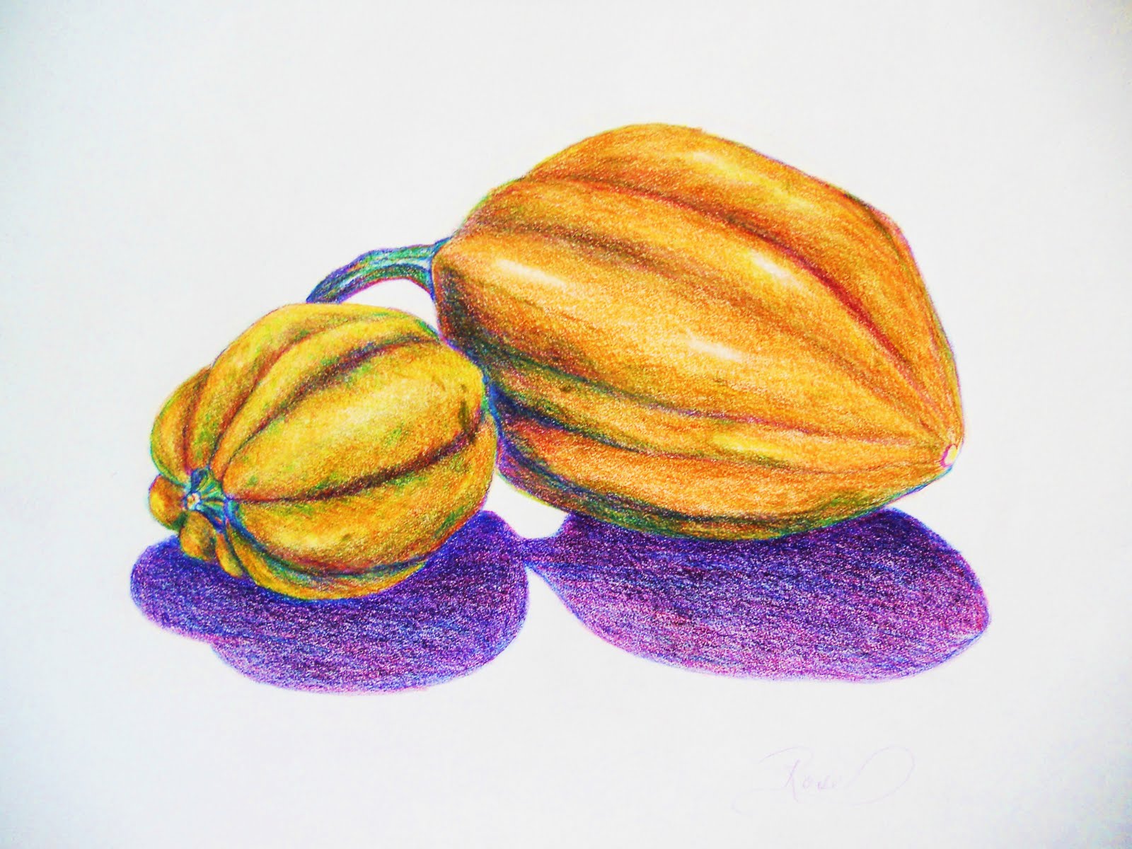
| GOLDEN ACORN SQUASH I have been experimenting with complimentary colors lately. They say that if you put the complimentary colors next to each other, they both become more intense, more alive and vivid. So my yellow squash needed purple shadows, and I do think that it made a difference, don't you? |
Wednesday, August 31, 2011
GOLDEN ACORN SQUASH IN COLORED PENCIL
BALD EAGLE: I FINISHED A PAINTING!!!
 |
| HONOR AND INTEGRITY |
I finally finished a painting! It has been a really long creative slump in my paintings, so this is a milestone for me. I am excited, inspired and just plain pleased as punch to be able to share this painting with you. It was a real labor of love, and a symbol of what my life is about. I have always had a very active conscience, and the thought of a lie causes such stress...well, let's just say that I am glad to have married a 'boy scout' who put honor and integrity in all he does. Life is so much easier when you have no guilt! I am quite proud of this painting, and hope you enjoy the 'eagle eye' and stern protectiveness that this piece embodies for me.
 |
| DETAIL OF HONOR AND INTEGRITY |
Tuesday, August 30, 2011
CHINESE WATERCOLOR PAINTING AND RICE PAPER
 |
| My mother loves Sumi brush painting and watercolors. She decided to expand my horizons this summer and got out the rice paper and the most amazing bamboo Sumi brushes. I had so much fun learning how to delicately move the brush to paint butterflies and bees. It is almost like calligraphy in it's precise brush strokes and abstract movements. Lovely painting, and so much fun to learn something new! Thanks, Mom! |

Monday, August 29, 2011
OUTDOOR SKETCHES

I am NOT an outdoors-type painting person. Plein-aire painting is no fun for me, battling the wind, gnats and people who want to look over your shoulder. However, DRAWING outside is another matter. I love the immediacy of the quick sketch. Recouperating from some hospital junk, I was bored, bored, bored! I decided to do some sketching of a few interesting things outdoors, before the sun got too hot. (Yes, Tennessee in August is still uncomfortably hot, though the humidity is down a bit.) These are bits of old machinery and an old dog house from the neighbor's yard. Amazing the beauty in all things!

Sunday, August 28, 2011
CHILDREN'S PORTRAITS: TIME TO EMBARRASS MY DAUGHTER!
 |
| Sketch from 1990 |
I found this old sketch of my daughter in an old portfolio, and it brought back lovely memories of drawing her while she snoozed on the sofa one snowy day. She had been outside building snow forts with her brother in the 3 feet of Wyoming snow, and had exhausted her normally inexhaustable energy.
I decided on drawing her at the age of 11, from a photo that really delighted me. She was always biting her lower lip in a nervous little habit that was endearing, and she was such a fragile, active creature that amazed me daily. Of course, neither portrait is nearly good enough, but they do bring back some lovely memories that, to me, are better drawn, rendered with charcoal.
 |
| Sketch of daughter from photo |
Friday, August 26, 2011
CHILDREN'S PORTRAITS: IT'S EMBARRASS MY SON DAY!
 |
| My son: age 2 months |
 |
| My son: Age 13 |
My series on portraits wouldn't be complete without doing some sketches of my own loved ones. This is by FAR the hardest portraits to do, by the way, as they never show enough of what you want to express! Using conte and charcoal, I used some old photos to do these completely different portraits. Babies are really hard to do, as they are so disproportionate early on. My son was always sticking his tongue out at me at 2 months, and continued that habit when he was a teenager as well. Glasses are hard to put on a face in a portrait, too. I am not pleased with the results of this attempt, but he wasn't pleased to have glasses, either. It wasn't too long before he was into contacts and grown up. Yikes! I really sound like a sentimental mom. I am. I adored my children as babies, and I adore them as adults. Drawing them brings back memories of board games and cookies.
Thursday, August 25, 2011
EAGLE: BUILDING UP THE BACKGROUND
 I put my easel up in my kitchen to work on this painting so that I could look at it occasionally with a critical eye. After a bit of thought, I decided to do the background a very solid color with no brush strokes or variations in color. I did this to showcase the busy-ness of the brushstrokes that will come later with the feathers. I did the background at this time to paint the eagle in front of it, instead of painting the background around the eagle. Doing the background last tends to make the painting look like a paint-by-number. Painting a solid background may look easy, but it wasn't! You never mix quite enough of the paint, and have to try to match it, and the acrylic dries so fast that the brushstrokes make little STICKY marks in the paint you are trying to blend into. Of course, I couldn't do it the easy way and add a retardent to the paint, allowing it to dry slower! As hubby always is saying, "You always choose the hardest path!" He let me know that I chose the most difficult angle to have the eagle's head, as well. He was right, of course. But it was just so effective this way! I took a lot of pictures of eagles to get this particular regal look. (Another good source for your sketches and paintings is the raptor rescue programs in your area. We have a great one here, and this eagle had broken it's wing. They named him Abe.)  MY PHOTO OF ABE, A RESCUED RAPTOR |
TITIAN: VENUS RISING DETAIL SKETCH

I did this sketch in conte crayon, with the need for some experience in learning more about the Masters' composition and portrait choices of head angles. Titian had a way with head movement that made it look so animated and lovely. I did a similar sketch back in my college days, when I was taking a clay sculpting class. The sculpture bust came out beautifully, but the kiln firing was a disaster! I obviously didn't hollow out the piece enough, and the ensuing explosion almost got me expelled. All that remained of that lovely face was a nose. I have since abandoned the use of clay, for the safety of others. I had to promise my professor never to try it again!
Wednesday, August 24, 2011
AUTUMN WATERCOLOR
 |
| AUTUMN COLOR MADNESS |
In anticipation of fall, I did a wild and crazy watercolor! I lived in the prairie states for so long, with trees few and far between, so I learned to really appreciate the low-growing prairie plants and all of their many colors. This particular landscape was from a little hill and valley area in Montana. This is a 9x11 watercolor on 140 lb paper. I allowed myself to release all control of my paint and let it flow whereever it wanted to go. Fun!!!
Tuesday, August 23, 2011
OWL OBSESSION


I don't know why our household has an obsession with owls. When we lived in New Mexico, I learned about animal spirits and fetishes of the Native Americans. My mother felt her animal spirit was the bear. I eventually felt 'chosen' by an owl, as they have been popping up in my life for years. Burrowing owls in South Dakota would peek at me from their ground burrows in our back yard. A huge barn owl targeted me in Wyoming, scaring the living daylights out of me! I eventually named my art studio "Wise Woman Studios" with the owl as my logo. Over the years, owls have exploded out of all proportion in our home. I am not much of a collector (well, except for tea infusers...and rocks shaped like hearts...and children's books) Anyway, every time I run across a particularly realistic and beautiful owl figurine, it comes home with me. It has become addictive, and maybe infectious, too. My hubby started with carving an owl into my art supply box. Then he found a piece of wood that begged to be carved with an owl. Then it was a piece of grey speckled granite, and old wooden spools. Not to mention all of the drawings and paintings I have been called upon to create. Weird how life heads you towards something!
EAGLE: EYE CLOSE UP
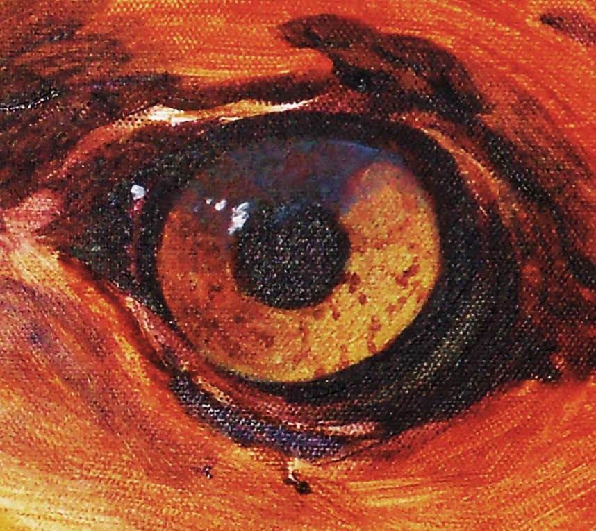 |
| BALD EAGLE EYE DETAIL |
The eagle is starting to shape up nicely. Today I chose some of the colors for the beak, and waffled between Hensa Yellow and Cadmium Yellow Medium. After experimenting directly on the painting, I chose the Cad. Yellow. It has a warmer feel about it. I also chose Cadmium Red Light to mix my gold and oranges with and did the first layering of color to build up the shadows.
I completed the eye immediately. If I don't get the eye right, the whole painting has to be scrapped. I wanted to get the sharp alertness that an eagle has, and that beautiful golden glow and depth. I will tweak it at the end of the painting, but for the most part, it is done.
I continue to adjust the sketch as I go along. This session I noticed a problem with the beak, and 'fixed' it with the charcoal first. I use the soft charcoal because I can wipe it off easily and redo over and over and over, until I get it right.
I mixed my own black for the eye and shadows on the bird. My mix: Ultramarine Blue, Dioxazine Purple, Hunter Green, and Raw Sienna.
Monday, August 22, 2011
CANDLE AND BOOK STILL LIFE: COLORED PENCIL

I am still learning what NOT to do when it comes to colored pencil work. What is wrong with this piece?
1. Too thin of paper
2. Not enough layering and building up of color, especially in the candle
3. Subject is 'floating'
What is right with the piece? Choice of color is effective, and proportions are spot-on. I particularly enjoyed building up the layers of the candleholder and the wooden-handled 'loader'. (It is an antique bullet mold, or something of the sort.) I deliberately chose complementary colors to make contrast, and am fairly pleased with the effect. I have been really influenced lately by the still lifes of some of those artists that I am following. (Check them out...listed to the right of the blog) Some of these artists, like Gwen Bell and Ryan are really gifted and amazing! I hope to be as good as them someday. Well, I can dream, can't I?

BALD EAGLE PAINTING: ACRYLIC
 |
| EAGLE IN PROGRESS... |
I am painting again!
I chose to do a portrait of a bald eagle. I did a bit of research, not only on eagles, but on my own past failures with paintings. Did you know that the reason eagles always look angry or stern is because they have a little fold of skin over their eyes that helps to shield from the glare of the sun and increase their visibility? The placement of that fold is like a lowering of eyebrows to us humans, and gives a look of solemnity.
As far as the past failures...I have noticed that the effectiveness of some of my animal portraits is decreased because I don't give it enough priority on the canvas. I start too small with my sketch! So this time I really filled up all of the canvas with the most important part of the eagle. I thought about what I wanted to communicate to the world, and put my basic sketch on the canvas with willow charcoal.
Right now I have the underpainting completed and have been adjusting my sketch of the eagle. I had made the back of the head too large, so have resketched in the charcoal, and washes of acrylic paint. I have the possibility of a good, effective painting started.
Sunday, August 21, 2011
DRAGON SKETCH
 |
| Winged Dragon |
Now for something completely different....I seldom do visionary fantasy. I don't feel I have the imagination for it. However, as Dali once said, 'draw what you dream'. I wanted to show that I have a bit of versatility, too. Though I have mostly a classical education in fine arts, I am like any other artist...wanting to step out of the box! And like most people, I have a mysterious past...oooooooo! I spent a few years as the newsletter writer (or Wordsmithy) for a local S.C.A. group. (That is the Society of Creative Anachronism, or renaissance faire-type group.) Hubby had mis-spent his college youth in a Fencing class, and had the time of his life doing fencing challenges. I found that I enjoyed doing historical research on the life and times of medieval folks. During that few years, I illustrated the newsletter, wrote it, and drew plenty of dragons. I never liked any of them. So it is amazing that I really like this one. I think it shows my inner nasty side. Oh, yes! Everyone has one! You know that YOU do, too! Think about it.........
Saturday, August 20, 2011
ART JOURNAL ENTRY: HEALING, HAVE I GOT ISSUES!!!
 |
| click on image to enlarge view |
Some of my art expressions for the art journal come out in surprising ways. I started out with no thought on what I was going to draw, and the turtle called to me. I realized that I was equating my progress in my art, life, and other areas of frustration in the slowness of a tortoise. Drawing it, writing it down...taking my time by changing the colors of the pen to make each thought separate, really worked for me. And please forgive the bad rhymes. I am a poet at heart, sometimes gifted but most times NOT!
Friday, August 19, 2011
WILL ROGERS: AN EXAGGERATIONAL PORTRAIT
 |
| Will Rogers |
Class was canceled this week, so I chose to do a well-known figure, exaggerating his more interesting features. Not quite a cartoon, but close! I enjoyed drawing this piece. It made me look for the more prominant characteristics of a man in a photo that I did not have the option of getting to know. More than that, the completed piece made me smile!
Thursday, August 18, 2011
ART JOURNAL ENTRY: A RAINBOW OF COLOR

Every so often I drag out my art journal to express my REAL feelings, both good and bad. This is the very first page of my journal, and I set free my thoughts on being an artist. I used every color of Sharpey felt tip pens that I could get my hands on and doodled, wrote and played. I find this is a great way to find balance in your life, get grounded (or centered, as Mom, the experienced meditater says) and let out a few festering feelings....few festering feelings...say THAT 10 times fast!
CONQUERING THE STUDIO

Do you feel that sometimes your studio has gotten out of control?
Do you have an addiction to art supplies that has gotten out of control?
Does household clutter end up in your studio when company comes, and it has gotten out of control?
Well, I am ashamed to say that my studio has become the bottomless pit of all things lost in this household. I am sure that all of the socks in the world that disappear from dryers everywhere are probably in there. Besides my art space, the studio houses the spare sofa (which I NEVER use), games and puzzles that come out only once a year, scrapbook supplies that have gotten WAY out of control, and even the seasonal clothing...sweaters that seldom get worn because we no longer live in the north!
I haven't actually painted anything in there in a year. I usually drag a few tubes of paint down to my kitchen table, along with a table easel.
NO MORE! I am taking control! I am reclaiming my space for art! With sword held high, I will smite at the evil infiltrators of clutter and claim victory over the chaos!
(Hubby, quit mumbling under your breath about my being a drama queen and help me carry stuff!)
Wednesday, August 17, 2011
THE UNCOMFORTABLE MAN: STUDY IN CHARCOAL
 |
| CLIFFORD |
"Clifford" was very uncomfortable with being a model. He sweated, he squirmed, he moved so much it was difficult to get a likeness. I don't think that he liked himself very much, and his discomfort made us all a bit edgy and glad to get the class over with. I learned a lot from the experience. It took several sketches to get even this semi-decent likeness as he dodged us all in an effort to not be known. I am not particularly happy with this portrait. But then, neither was he!

Tuesday, August 16, 2011
LEONARDO DA VINCI: OLD MAN SKETCH AND POEM
 |
| Study from Da Vinci Notebooks |
I have learned a lot from studying some of the master's sketchbooks. Da Vinci had a delicate hand with shaping and details, and I think that he showed real emotion with his work. Perhaps the only portraits I have really admired and wanted to emulate is Da Vinci's. Here I have tried once again to learn from the beauty of his self-portrait that man can be incredible, superb, and full of character.
THE FACE
I saw a face with
character today.
It wasn't pretty,
It wasn't classic.
The face had
weathered features.
It had wrinkles.
It was crooked.
The nose was large
and bulbous.
It was broken.
It was hawkish.
The brows were wild
and wiry.
They were bushy.
They were connected.
The eyes were
slightly crossed.
They were hazel.
They were piercing.
The chin was full
of bristles.
It was square.
It was determined.
The face was full
of character.
It was beautiful.
It was timeless.
---poem by Rose Altom
Monday, August 15, 2011
PORTRAIT OF AN OLDER BUT WISER WOMAN
 |
| CLARISSA |
I call her Clarissa. While I was sketching her, she spoke of regrets and truths. I thought about my own choices and paths while I drew her. Had I learned anything over my own years...or was I sliding along, taking life as it came to me? Clarissa has something to say, to reveal, and to teach. I hope I was willing to listen and learn...
Sunday, August 14, 2011
CHARCOAL AND CHALK PORTRAIT
 |
| TYLER |
 |
| TYLER, DETAIL |
This was a sweet young man, the son of one of the artists in our group. He kindly consented to pose for us when our model couldn't make it to class. He was shy, slightly embarrassed, and a wonderful model. I chose a 3/4 view to sketch and grey newsprint paper. We used a strong light to get enough contrast for a good portrait. I chose to call him "Tyler", which is not his real name,of course! I am not sure I got his ears perfectly aligned, or even the right size. I am rather pleased with the results, however.
Saturday, August 13, 2011
PORTRAIT IN CONTE CRAYON: OLD MASTER'S STYLE
 |
| AMY RAIN |
 |
| AMY RAIN, DETAIL |
I don't do portraits very often, but I love working with the conte crayons. I was lucky enough to get into an exceptional life drawing class not long ago, with a lot of interesting models to work with. I will be featuring the occasional conte and charcoal portraits over the next week or so. These particular pieces are not permanent...that is to say that I chose to recycle old paper grocery bags. I love the color of them, and I love the texture and 'tooth'. It is also a plus to know that the sketches were not 'forever' pieces, and I could ease my anxiety about messing anything up, yet get loads of experience doing faces. I especially enjoy looking for the shape through light and shadow. I think that it makes the drawing more 3 dimensional and more interesting. I wasn't too concerned about getting a perfect likeness, though that was a plus if it happened!
This first drawing was fun. The woman had made her own hat, and admitted to loving the 1960's so much that most of her clothing reflected it. I chose my spot in the room to try a profile, and emphasize line for this particular person. She had a fascinating shape to her face. I call her "Amy Rain".
Friday, August 12, 2011
TEA AND SYMPATHY

When I was little, and got a cut or scrape, my mother always got out the Constant Comment tea and brewed us a cup...for some 'tea and sympathy'. I am drinking a lot of tea this week! I am having some heart problems, (hopefully fairly minor) and am feeling a bit under the weather. I am also dealing with a bit of self-pity, and trying to whip my attitude into shape! Mom always said that tea will cure what ails you. I am taking you at your word, Mom! The box of tea is on the tea cart, as well as my favorite teapot. It is getting a bit cooler lately, so maybe I will make a batch of cherry hazelnut scones to go with it....

BEADED CIGARETTE
 |
| Beaded Cigarette by Seedybeader Check this out! This is NOT A REAL CIGARETTE! My best buddy, the Seedybeader, made this with bead weaving techniques that boggle my mind, and would probably strain my eyes. She does the most amazing beading, specializing in necklaces and medicine bags. Look for more pictures of her work, because she is just amazing! (I bought my daughter this 'cigarette' to hold while she tries to quit smoking. She can't ever figure out what to do with her hands when she tries to quit. Maybe this will help.) |
Thursday, August 11, 2011
LOOKING AHEAD TO HALLOWEEN
 |
| Norman Rockwell study I have been practicing obbozzo (see my Artipedia section to the right), doing some sketching from some of Norman Rockwell's seasonal paintings. I loved the view of these children as the innocently go off to Trick or Treat, wishing their hardest for lots of candy. I find sketching from some of the master artists a good education for learning composition skills and technical knowledge. |

This is my own cartoon of the look of fright reading ghost stories. I am horrendously bad at cartooning, but it isn't going to stop me from having some fun with it!
Wednesday, August 10, 2011
CHARCOAL PENCIL TEA BALL
 |
| Tea Ball My favorite season is on it's way! I love fall, autumn, cool weather, or just any excuse to have a cup of hot tea! My mother and I used to have tea parties when I was a child, and I did the same with my children. My daughter's favorite teapot was a blue chintz cat-shaped one, and she loved peppermint tea. My son's favorite teapot was a vampire, and red zinger was his favorite tea because it looked red like...well, you know! I have had every type of tea imaginable. Most memorable over the years were watermelon tea, China brick tea (shaped into a small brick that you broke chunks off of to brew), and recently I was excited to try bird's nest tea. Tea leaves are shaped into small bird's nests and buried in the ground to ferment for 5 to 100 years. The flavor is incredible! Over the years I have painted tea-inspired oils,acrylics and watercolors, and sketched many a tea kettle and tea infuser. It is a continuing theme because it is a big part of my life. Tea cures all, including the soul! |
Tuesday, August 9, 2011
NATURE'S MANDALA
 |
| Basket Flower: Photo by Rose Altom I have been reading about Mandalas lately in my excursions into finding inner peace. Supposedly, as you create your circular mandala, it brings about a meditative state. I have been looking for some of the natural mandalas that surround me, and this Blanket Flower (or Fire Wheel) was the perfect one. |
Saturday, August 6, 2011
ARTIST CHALLENGE #54
 |
| Christmas Memories: Original Oil with Morager, $650.00 (Postage and Insurance Paid) |
 |
| Creek Darling: Oil on canvas NFS I have entered the Artist Challenge #54 - Remember Me http://www.theartistchallenge.com/ These 2 paintings are by far my most memory-filled pieces. "Christmas Memories" was my tribute to the best of Christmas, which is children. These are my own children's favorite toys to play with growing up, and it was the type of toy that they would help me to pick out to give to Toys For Tots (whom the U.S. Marines set up to get toys to children in need at Christmas). "Creek Darling" was a wonderful memory for me, as it is the place that I chose to teach my son to drive. We were living in North Dakota at the time, and that state park was close and usually deserted in the late fall. We saw so many wonderful things in nature there. Large flocks of eagles would perch in one particular tree there every year when they were migrating...a miraculous sight! We identified dozens of beautiful ducks and geese at the Lake there, and my son and I actually rescued a large and really prickly porcupine one day while driving through. I wanted to show the amazing golden glow the late afternoons had, and the feeling of contentment and peace. Both paintings brought back lovely memories, and were a joy to create! |
Friday, August 5, 2011
COLEUS: SKETCH AND NOTES
 |
| Coleus Sketch and Color notes Part of my creative process, especially when I am doing sketches that will later be used in a painting, is to make detailed drawings with color notes to remind me what it looked like. These notes are invaluable, because you tend to forget those feelings that the color invoked at the time. It is a little reminder that will round out your painting later. This was one of many sketches that I did with this foliage plant, and some of the other drawings had copious notes on the more emotional aspects that the colors brought out for me, personally. I try to write down more specific colors as well, such as Sap Green, Veridian, or Cadmium Light Yellow. Then I write about the mood of what I have in mind...'use late afternoon golden light to generate a feeling of nostalgia'. Or 'backlight this area to emphasize the line of the stem'. You have to use a process that really works for you and doesn't bog you down in too much of the details without the heart that goes into your piece. |
GOLD PANNING DAY!
 |
| His and Hers Gold Pans What better way to spend a hot summer day than to go gold panning? Hubby and I both love to go digging in the dirt looking for gemstones and gold. We never find much, but we have such good memories that we have made over the years. I still remember the first time we went, up in the Black Hills of South Dakota. We set up our son's playpen beside the creek and panned for gold in the iciest water I have ever felt! Thirty years later, and we still love to get out and hike the trails, hunt for treasure and spend time together. Sure beats going to the movies! (And yes, I ALWAYS bring my sketchbook with me. You never know when inspiration will hit you.) |

Thursday, August 4, 2011
CANNA LILY PHOTO
 |
| CANNA WITH BEE Not being a woman with a green thumb, I am especially proud of my canna lillies this year. I was delighted to find out after processing this photo that I had actually captured a tiny bee in flight coming in to enjoy the nectar! |
Wednesday, August 3, 2011
BEAR CUB MINIATURE
 |
| Smoky Mountain Bear Cub I did another miniature....2"x3" acrylic on canvas. My intention was to get something.....ANYthing completed in one day! Sometimes the big paintings can get so bogged down that they don't want to be completed! So small is in right now. I kept it simple, just enough detail to give you attitude and innocence. Interesting story...I was hiking up in the Smoky Mountain National Park, not too far from the main roads, just off of Alum Trail. Out of the brush comes this sweet baby, who was just as surprised to see me as I was to see him. Quick to my camera, I took a few reference photos, as I was very CAREFULLY backing away! Mama bear is always nearby, and you do NOT want to get between her and her baby. I count myself lucky to have seen this cub, survived it, and not disturbed it. I took creative license with the colors. I was thinking it was so black it shimmered blue, so that is how I painted the fur. Normally I will add the complimentary color for contrast, but I chose a pinky flesh tone for the white muzzle. Subtle, and I am hoping it projects the cub's curiosity and youth. |
Tuesday, August 2, 2011
SOFT-LEAD CHARCOAL PENCIL SKETCH

An artist is ever seeking another subject to draw. I discovered a lovely little leaf nestled in the blades of grass that had high contrast light and shadow. I used a soft-lead charcoal pencil to really add contrast to that light. I took an ant's eye view of it and suffered only minor mosquito bites for the effort. Every time I scratch the itch I will think of this sketch!
Subscribe to:
Posts (Atom)